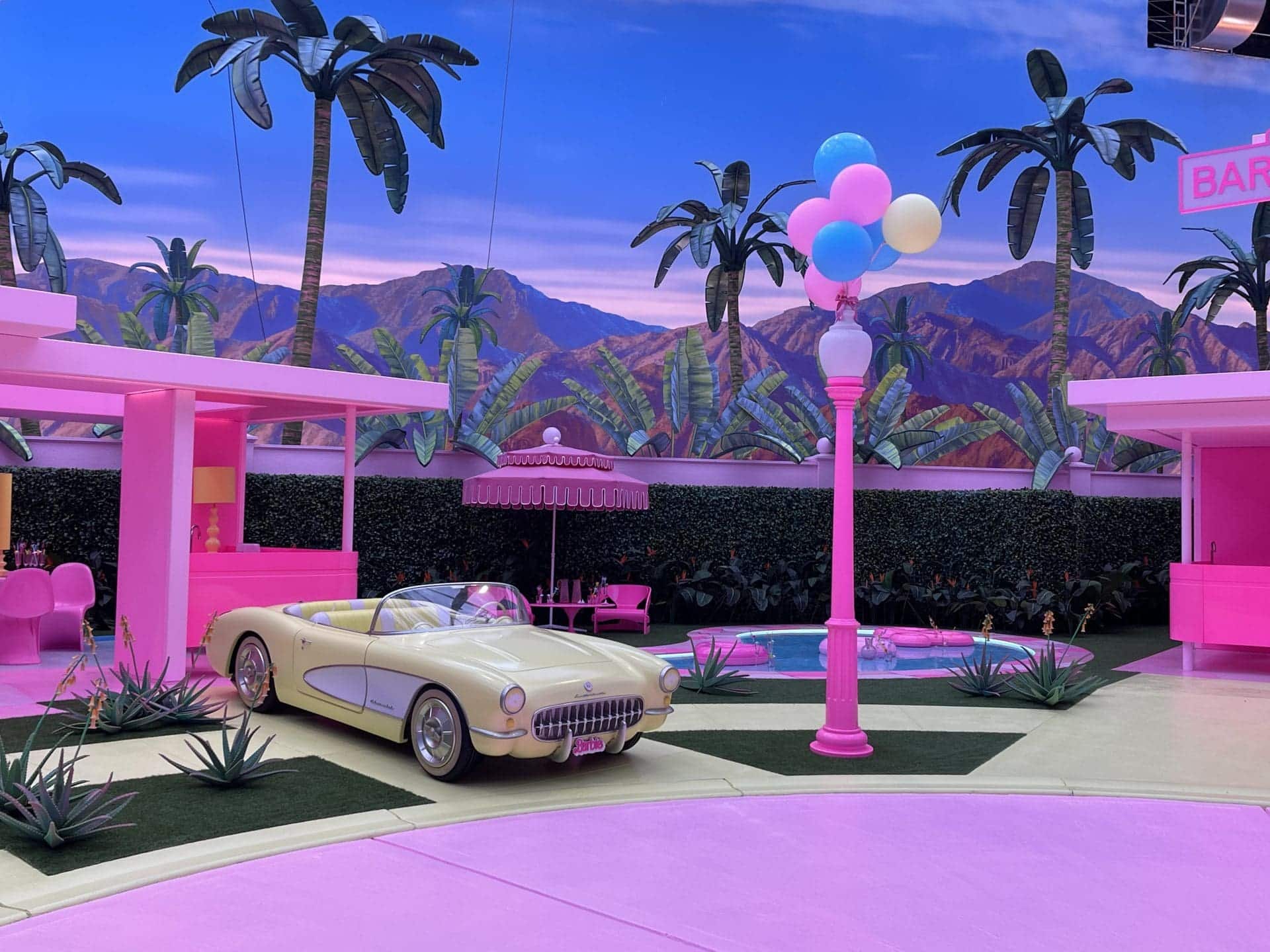
When production designer Sarah Greenwood got the call telling her she’d been selected to work on Barbie, she was halfway up a live volcano. “We were filming the last week of Joe Wright’s Cyrano de Bergerac on Mount Etna. There were two metres of snow and we were staying in this ski lodge. And then I got this phone call from LA about doing the set design on Barbie. It was the most surreal juxtaposition of worlds,” says Greenwood.
For Katie Spencer, a set decorator (and long-term collaborator of Greenwood’s), the surreality came in learning who would be directing the movie. “Greta Gerwig and Barbie—that was the weirdest combination,” she recounts. “This incredible writer and feminist. I thought, well, this is not going to be your average Barbie.”
Average, it certainly wasn’t. Gerwig’s Barbie, which stars Margot Robbie as the iconic Mattel doll, grossed $1.4bn at the box office globally. Yet beyond the who’s who cast, dazzling brand partnerships, Mark Ronsonproduced soundtrack and Chanel costumes, Barbie’s most salient element was undoubtedly the set design. When I meet Greenwood and Spencer in January at the BAFTA offices in London, the pair are celebrating the news of their Oscar nomination. Whilst Gerwig and Robbie have been “snubbed,” in the director and best actress categories, the talent of the people who built Barbie is fortunately not up for debate.
Gerwig was a longtime admirer of Greenwood and Spencer, whose credits include Atonement, Anna Karenina, Sherlock Holmes and The Beauty and the Beast. “What Greta liked about our work, all the way back to Pride & Prejudice, was the creation of an entire world,” says Greenwood. “And it doesn’t matter if it’s set in the 18th century or if it’s sci-fi. It’s how we make the world for the story and the characters.” This was particularly important when it came to making a story about a doll feel ‘real’. “When you think of Barbie you think of something very simple and two-dimensional. It was about how you bring that to life,” says Spencer, motioning to our surroundings. “We’re sitting here and we’ve got coffee cups and salt and pepper and all that. You look at this table, it tells a story. You look at this room, it tells a story. You look at this building, this capital city—it all tells a story.”
For Barbie, the first aesthetic conundrum was to select a shade of pink. “There were pinks we couldn’t use,” says Greenwood. “Greta called one of them a pornographic pink—a very 1980s perfume pink.” Gerwig also didn’t want to go down the millennial pink route. (“We immediately googled ‘What’s millennial pink?’” says Greenwood). “It took a lot of arriving at,” says Spencer. “We mixed the pink [. . .] it’s based on a Rosco pigment and when you look at it in the pot it’s like a treacle, really dark. You mix it with white and you can create various shades. What’s lovely about it is there’s no blue in it. There’s a real purity to the look – it was like nothing anybody had ever seen before.”
Barbieland—the pink paradise Robbie’s Barbie inhabits with all the other Barbies when the film begins—was shot at the Warner Bros. Studios in Watford, Hertfordshire. Working with a $100m budget across seven different stages (the largest of which was “250ft long, 140ft wide and 50ft high”) for Greenwood and Spencer the sky was sort of the limit. Yet the pair had to create their own parameters for what Barbieland should (and shouldn’t) be. “The philosophical discussions we had about it were very nuanced and endless,” says Spencer. “It’s always about finding the rules to your world, which is what we always do. This can be more about what’s not there than what’s there.”
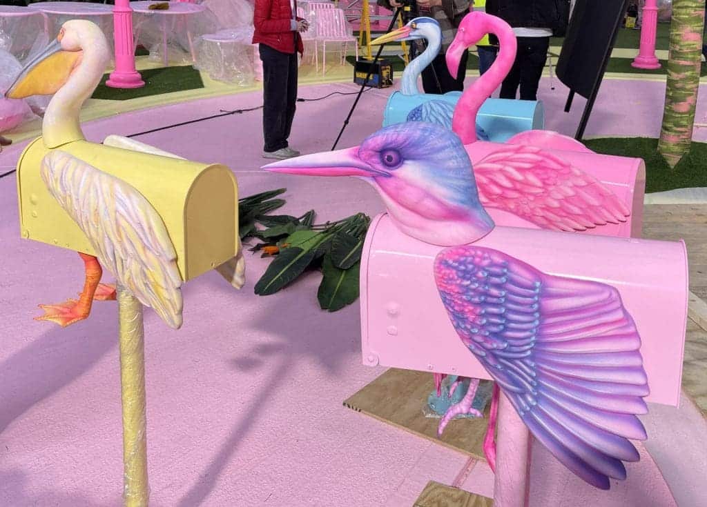
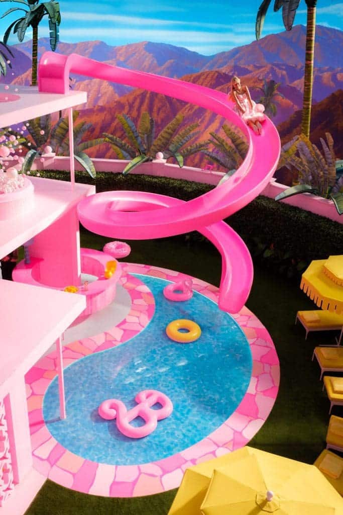
Architecturally speaking, their first rule was the absence of stairs. This was in order to mimic how children play with dolls – jumping them from one flight to another rather than carefully tiptoeing them down steps. Scale also added to a sense of playfulness. “All the houses were reduced by 23% – that was an arbitrary figure, but we found when we were playing with Barbie Dream Houses that when you put her hand in the air she can touch the ceiling,” says Spencer. “We discovered it’s something Mattel calls ‘toyetics.’ It’s what makes a toy. It’s the same when you want to put her in a car and she doesn’t fit. So we reduced the size of everything so the actors would appear bigger,” says Greenwood. “That’s also why she has the giant toothbrush – because she has such little fingers, it has to be made much bigger.”
Barbieland’s cul-de-sac of dreamhouses is also free of walls. “The absence of walls means the vistas are huge… but if you can see into another room behind, it gets difficult,” says Greenwood. “There had to be clarity in everything so it wasn’t cluttered.” To ensure such precision, more rules were required. “We put strong shapes in. There was no black, no white, no chrome. There was no air. There was no water. There was no electricity or wind. No elements,” clarifies Greenwood. For ‘objects’ a mixture of real and ‘decal’ were used, such as on the stove and oven, as well as the groceries in the fridge. “Decal is an American word for stickers that we really like,” says Spencer.
The division of real and fake was an importance balance to strike. “We watched things like Steve Carell’s Marwen where it goes into that uncanny valley territory and it all gets a bit too weird,” says Spencer. “Greta’s approach was more Brechtian – so once you’ve seen it half a dozen times you take it on board, and believe they’re dolls. But then occasionally it comes again.” Spencer references the scene where Ken, ‘beaching’ runs with a surfboard and bounces off a plastic wave, spinning out or where Barbie falls on her side as a doll might.
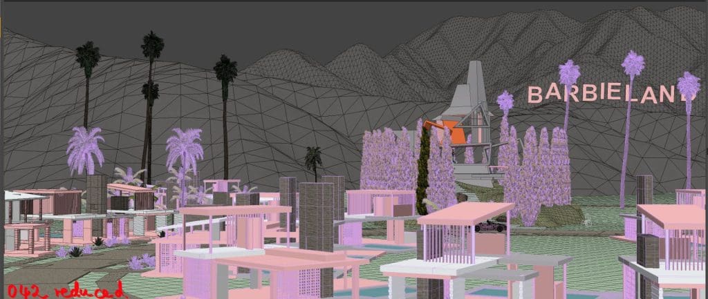
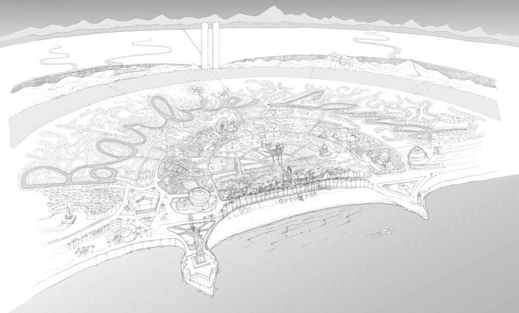
Whilst Spencer and Greenwood explain that they did not themselves play with Barbie (in the UK, Cindy was the doll of choice when they were children), they immersed themselves in it. “Barbie is so monumental in the States. It’s like Coca-Cola. It’s part of their DNA,” says Greenwood. To build the house they examined Barbie’s abodes, from the cardboard houses of the 1960s to her Huf Haus-style dreamhouse. But their final design was more inspired by the houses of Palm Springs, with mid century modern-inspired furntiure and individual swimming pools (fake, of course) and their own exotic bird-adorned mailbox. “We have a fascination with all things American.” says Spencer.
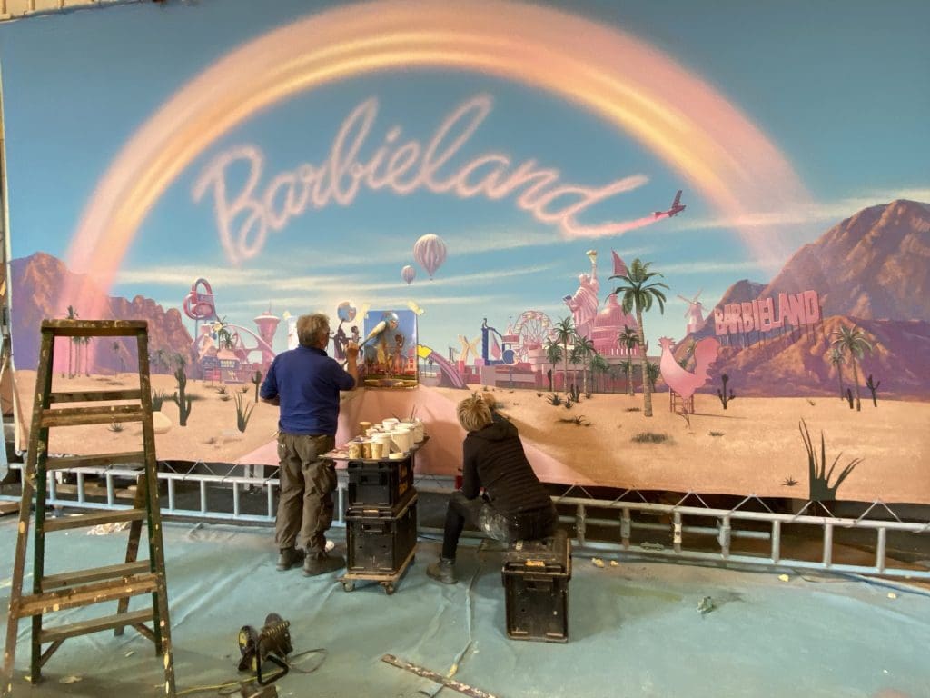
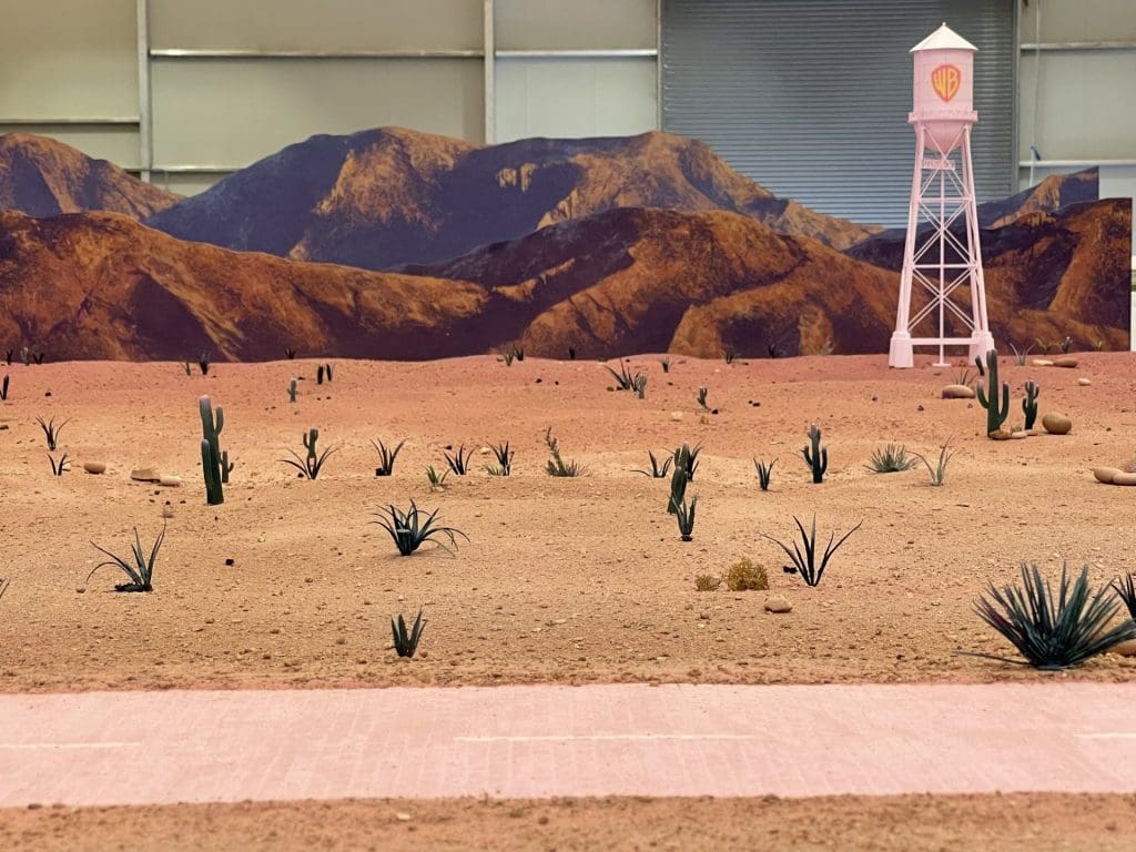
Whilst being hermetically sealed, Barbie’s universe was also intended to feel expansive. The miniature department was called in to create buildings and objects in the ‘world beyond.’ Shops, cinemas and pet shops were made as miniatures before being scaled up in post-production. “It feels really real and tangible,” says Spencer. “But then it still keeps its toy-feel.” The mountain backdrop meanwhile, was designed after that of San Jacinto, Palm Springs. “What I love about LA, and Palm Springs in particular, is that you have this incredibly harsh and pure sunlight. And as it moves around the mountains you have these incredible shadows,” says Greenwood. “Flat grass with palms and sunshine – it’s very graphic. Our DOP Rodrigo Prieto did something very interesting – he’d have seven massive ‘suns’ rigged so you’d be lit from every angle. Because it’s always a perfect day in Barbieland.”
There had to be clarity in everything so it wasn’t cluttered. To ensure such precision, rules were required. We put strong shapes in. There was no black, no white, no chrome. There was no air. There was no water. There was no electricity or wind. No elements.
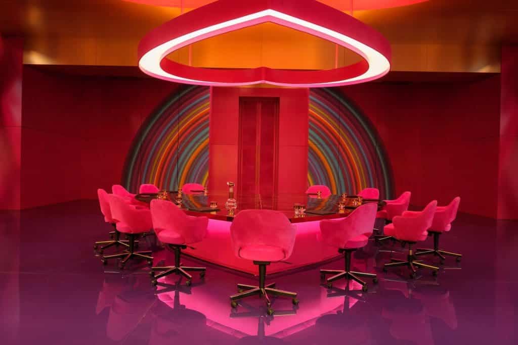
Barbieland however, is only half of the story. “People say, oh you’re creating Barbieland, but it only lasts for as long as the credits roll. It’s only the perfect day for the first 12 pages of the script – until the party and Barbie asks if people think about dying… So the question is how does the world change, and how do you change the world?” The beyond spaces were also a source of experimentation – from the pink road inspired by the Wizard of Oz (“we literally used the same sized bricks,”) to the Mattel offices – a crossover between Jacques Tati’s grey offices in Playtime and a six year-old girl’s bedroom with its heart-ceiling. “Greta just loves film,” says Greenwood. “And using all the old school techniques, that was so lovely. The craftsmanship was incredible. Keeping the old school techniques alive in such a modern film. It’s alchemy. A little bit of film magic happened there, I think.”
Despite the budget, scale and impact, Greenwood and Spencer don’t believe their work on Barbie to have been all that different to other films they worked on. “We see Barbie and Anna Karenina as cousins in different countries,” says Greenwood. “They’re both obviously these strong sensual heroines. And actually by taking Anna and putting her in that theatrical setting, even though it was true to period, what we learned from that is you can take a character and put her anywhere. So I think taking this extraordinary character of Barbie and putting her in this theatrical setting, they have these similarities.” says Greenwood. “The actors ice skating in an ice rink in the theatre believed they were on the River Neva. In the same way that they’re driving through Barbieland and they believe they are there. It’s a step away from reality, but into a different reality.”
For the most part, the set design of Barbie has been safely locked away by Warner Bros. “It all goes into this vault – it’s very raiders of lost ark,” says Greenwood. “The Barbiecar is next to the Batmobile.” As a small memento, Spencer kept a miniature palm and a sun lounger. “By the end of the film you’re sort of fed up with it. I wouldn’t want a pink sofa,” says Spencer. “It’s a bit like when you go abroad and you think this pisco sour is fantastic and you get it home and it doesn’t taste the same. It’s best where it is,” adds Greenwood.
The duo’s next project to be released is Sam Taylor-Johnson’s Amy Winehouse biopic, Back to Black. The project bears some similarity to Barbie – they were allowed to use Winehouse’s official logo and branding, whilst they recreated the large-scale structure of a Glastonbury. Yet more intimate, biographical research was also carried out. “We found a stage set with her original drapes,” explains Spencer. “We visited Mitch [Winehouse’s father] in the reccy and we used the courtyard behind Amy’s actual flat to film. There’s quite a lot of authenticity about it,” says Spencer. “Yes, Black to Black – literally,” says Greenwood. Spencer, however, quickly corrects her. “Although we did use a bit of pink in it.”

